Nequi App Redesign
Nequi is the most popular banking app in Colombia, serving over 20 million users, including small businesses, entrepreneurs, and students. However, usability issues were impacting user satisfaction and engagement. Our goal was to redesign the app’s UX/UI to create a seamless, intuitive, and enjoyable experience, ultimately enhancing user retention and satisfaction.
Colombia
Banking
20+ million
Challenge
The app’s cluttered interface made navigation challenging, preventing users from easily accessing essential features. The interface was not accesible for different communities and made an negative impact in the app's engagement. Additionally, the design system was ineffective for the design team, and the handoff process with the engineering team required restructuring to improve workflow and collaboration.
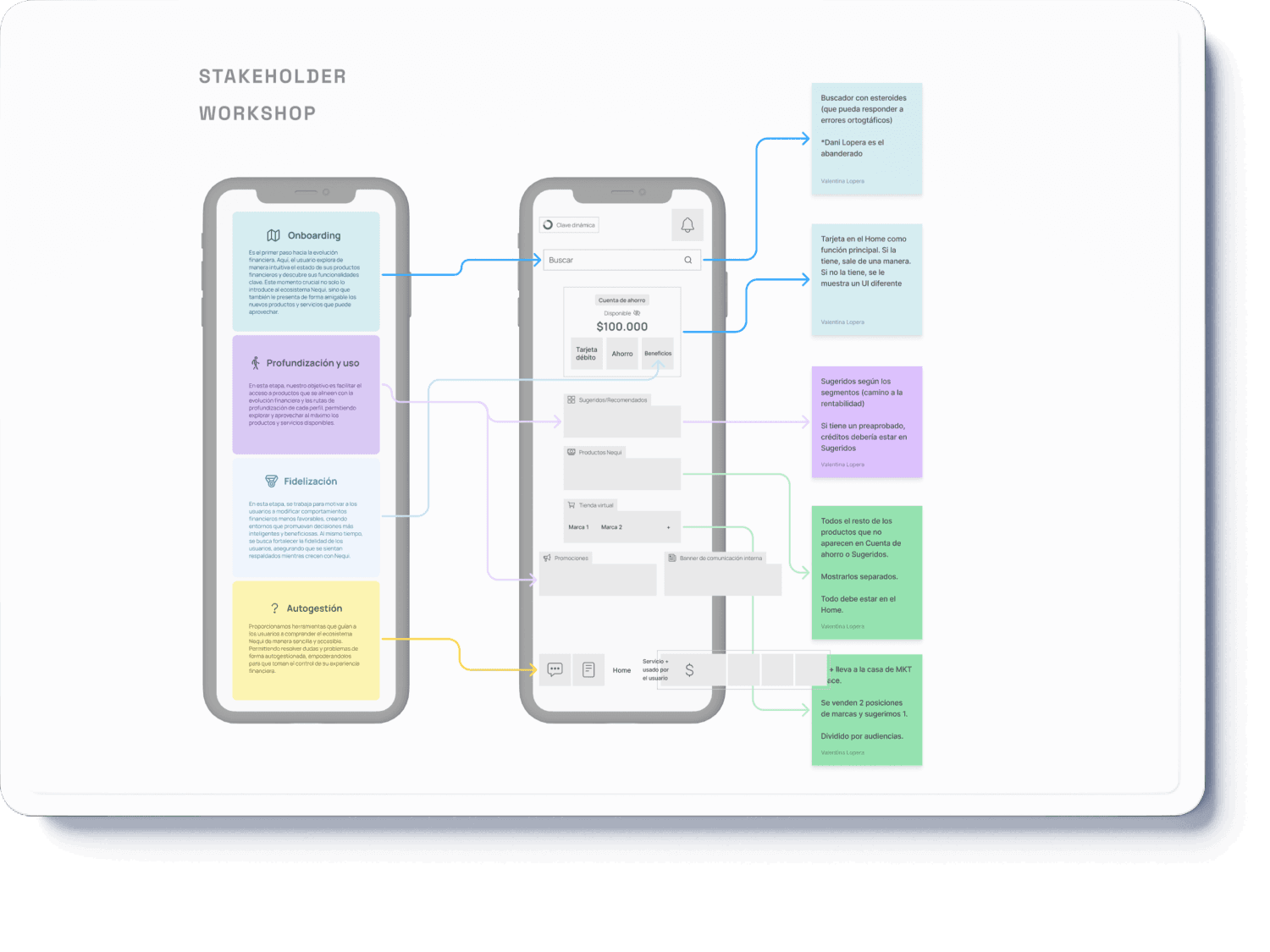
For the kick-off, we conducted a workshop with the stakeholders involved in the project to gain a deep understanding of business needs and assess the prioritization of new features. Through collaborative discussions and strategic alignment, we identified key pain points, defined clear objectives, and established a roadmap to enhance the product’s impact and efficiency.
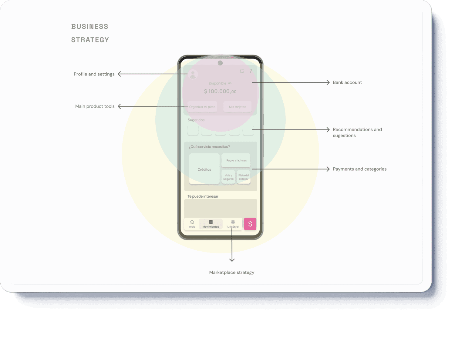
Considering the business strategy, we analyzed the optimal layout and distribution of elements and functionalities within the app's Home screen. Our goal was to enhance usability, improve navigation, and ensure a seamless user experience while aligning with key business objectives. Through data-driven decision-making and user research insights, we identified the most effective structure to maximize engagement
Process
Research & Analysis: we conducted user interviews, surveys and analyzed in-app analytics to understand the pain points and user needs. We also studied competitor apps and industry trends to gather insights.
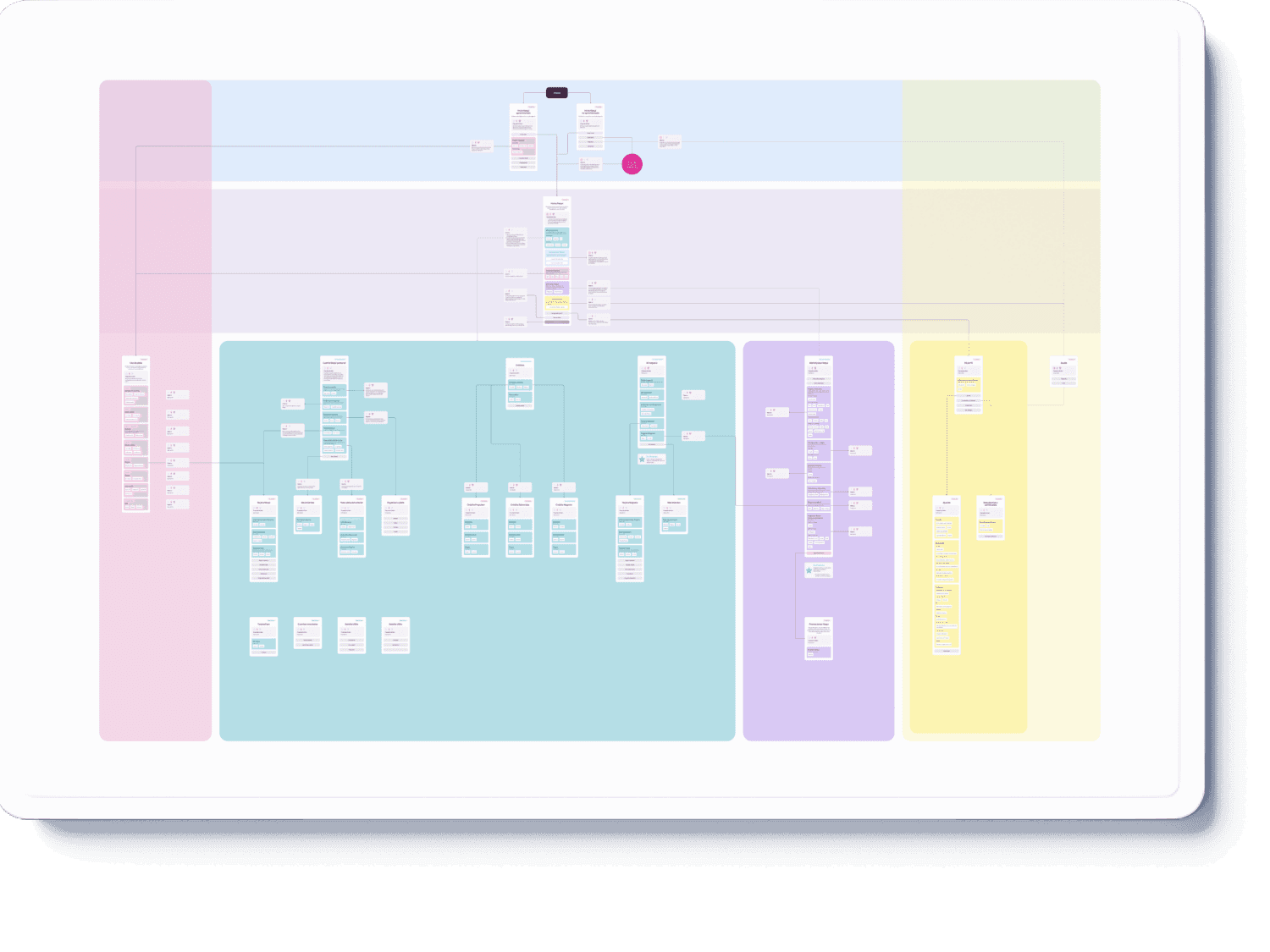
Information Architecture: based on the research findings and the business strategy, we built a sitemap and restructured the app's navigation and content, prioritizing features and information according to user needs.
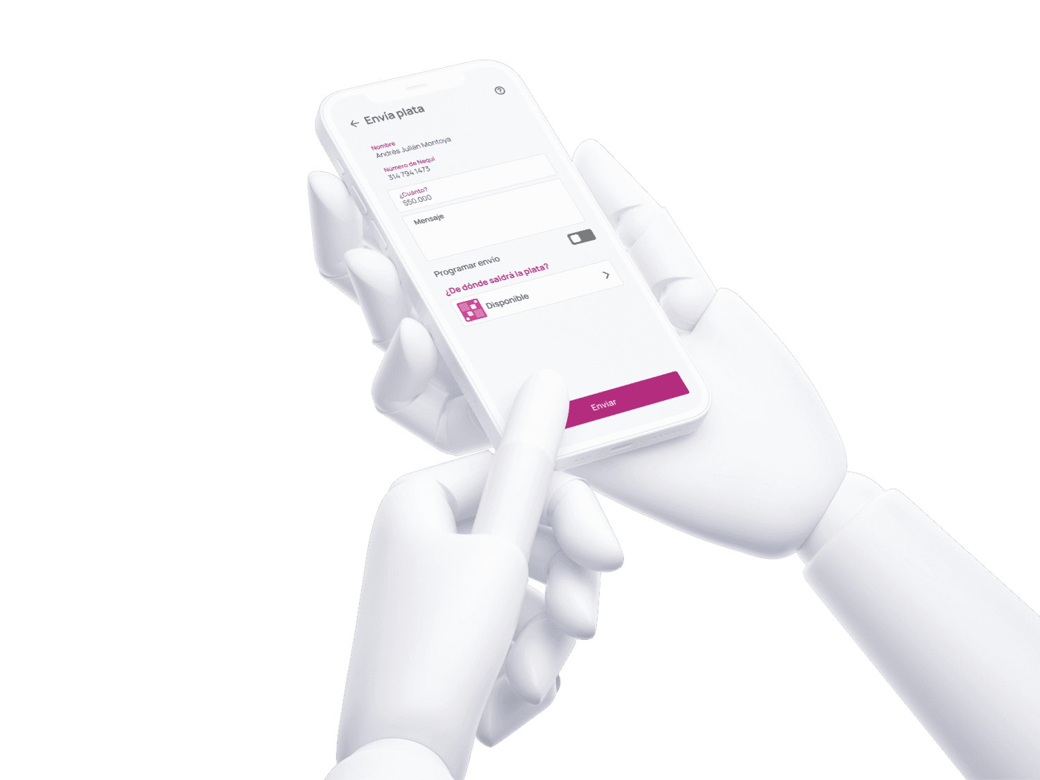
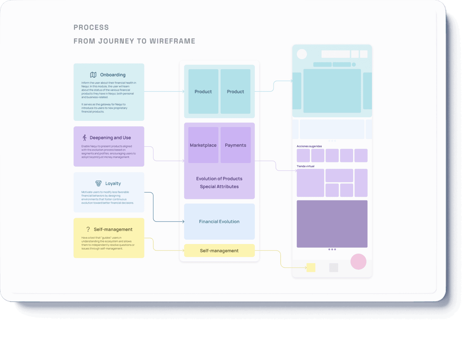
Wireframing & Prototyping: based on the optimal customer journey, we designed low-fidelity wireframes to visualize the new layout and navigation, iteratively refining them based on user feedback. Afterward, we built a high-fidelity, interactive prototype to test the design.
Usability Testing: we conducted usability tests with a diverse group of users to validate the design and identify areas for improvement. Based on the feedback, we made necessary adjustments to the design.
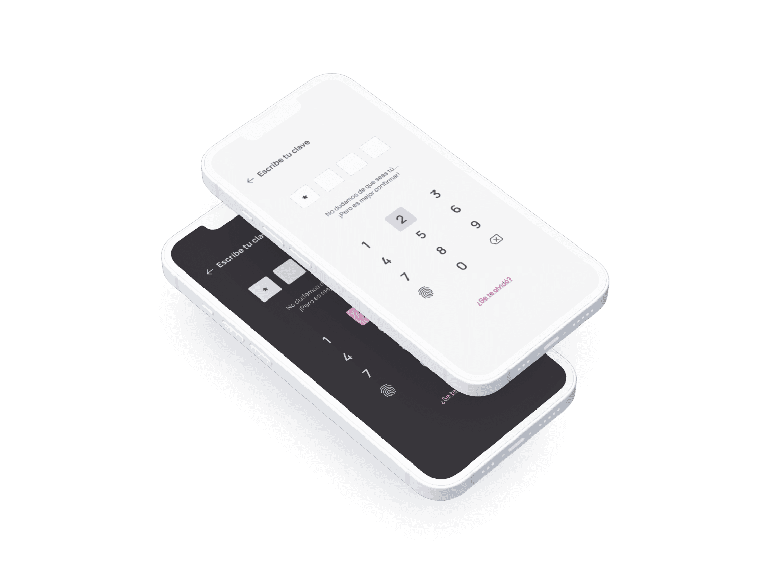
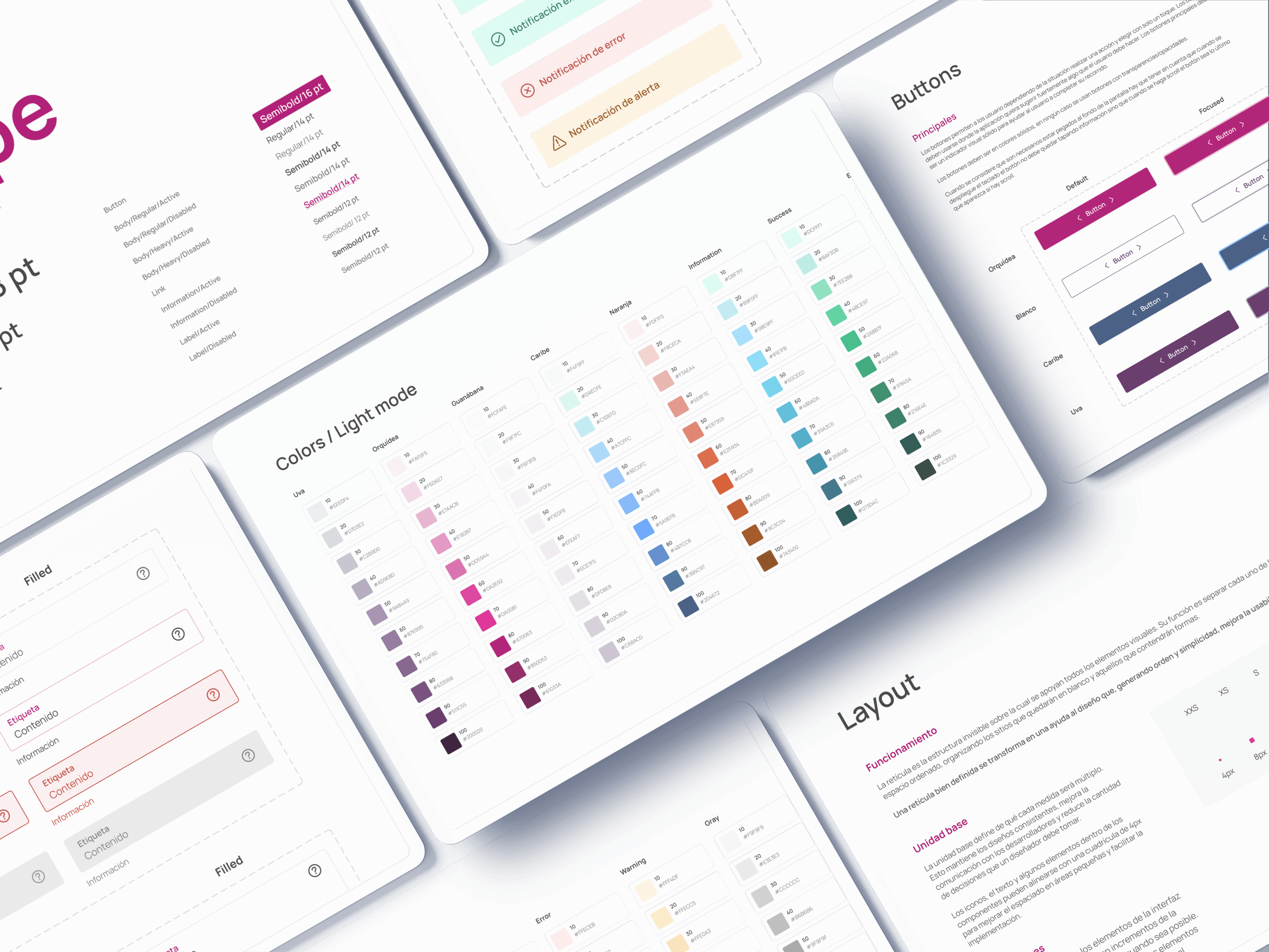
Design system: we developed a cohesive design system, including tokenization in color schemes (both light and dark mode), type, and iconography, ensuring consistency throughout the app. We also created a documentation and handoff system to secure the correct component usage throughout the whole platform.
Results
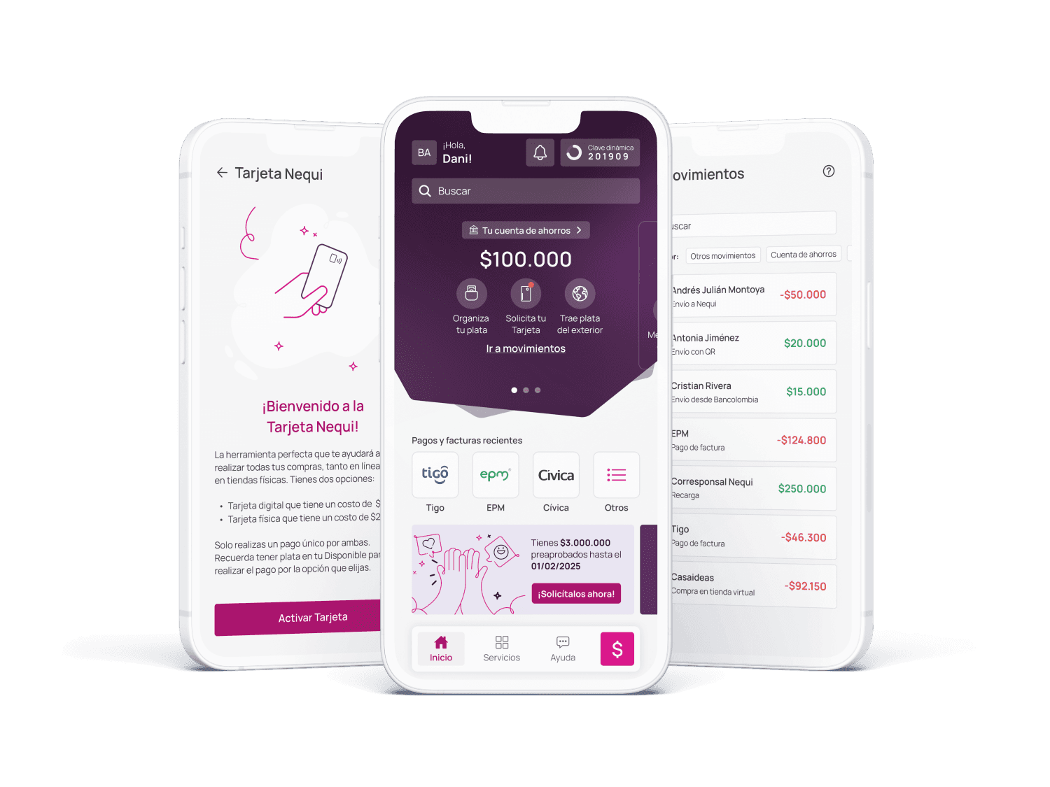
The redesign led to significant improvements in usability, accessibility, and overall user satisfaction. By implementing a scalable design system, restructuring the information architecture, and refining the onboarding process, we enhanced navigation and streamlined key user flows. Continuous user research and iterative usability testing allowed us to validate design decisions, ensuring an intuitive and seamless experience.
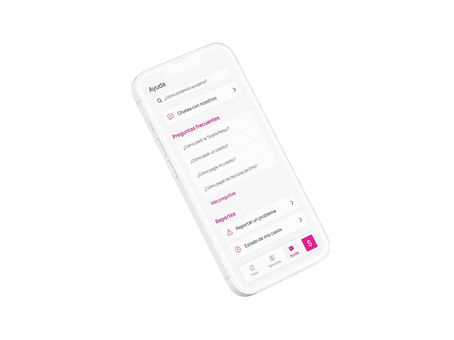
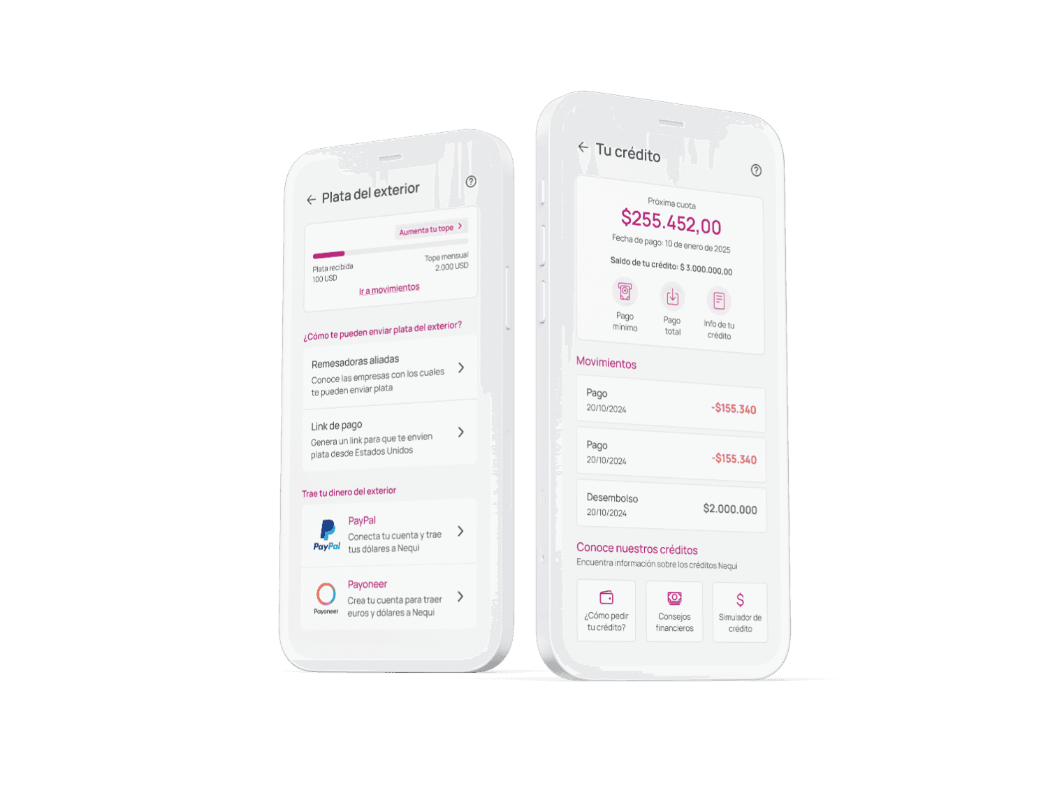
As a result, we observed increased engagement, higher retention rates, and a more efficient collaboration process between design and development teams, ultimately aligning the product with both user needs and business objectives.